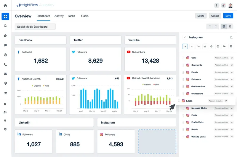
Understanding complex data can be confusing and hard to comprehend when reading numbers and data. That’s where turning the data into visuals can not only make it easier to comprehend, but more compelling.
Creating compelling visual narratives is more than taking data and making a table, it’s a series of principles that make it effective for the intended audience. There are design elements such as consistency and simplicity that are vital to the data making sense, such as having consistent fonts, coloring, and layout. Simplicity comes into play in making sure that the information isn’t overwhelming, but is put into basic and quick-to-understand visual graphics. For visual ease, making a clear hierarchy is also important. How? Color and sizes can help draw attention to larger or smaller data results.
Now that there are the basics of creating the visual data sets to help your audience understand complex information, it’s important to recognize the importance of the information. This can be done by the order you present the visuals, placing one graphic before a second one to show a change, the growth, or importance between one set of data and the other. Your visual narratives are just that, a narrative. You must be making a narrative from the data, with a clear beginning, middle, and end. Creating a call to action through the presentation is something that a bunch of words on a page doesn’t always have the ability to do – when people visually see the results or impact of something, they are often more compelled to contribute to change.
Also Read: Data Analytics for Beginners: Getting Started with InsightFlow Analytics
So how do you create complex data into a compelling visual narrative? Start by storyboarding your data. Create a rough outline of your plan – where you want to begin and what your end point is. Think of little things like the font and colors you will be using, and how that will engage your intended audience (for example, if you are in a creative field, using branded colors could be well received, but if you are in a high-stakes professional field, using simple colors would probably go over better). Make sure that in your plan you are only including what is necessary, and not adding in too much “fluff” information that will not be well received by the audience. You should also take into consideration which form of visual data will be the most effective: is it line graphs, pie charts, bar charts? Decide which chart will best emphasize the information you want your audience to be drawn to.
Ultimately, you want the information to be easy to understand. Complex data does not equate complex visual narratives. Use the visuals to turn the data into something compelling, eye catching, and easier for your audience to view and be moved by. Visual data can simplify even the most intricate information, and make it straightforward. Using visuals draws attention to the importance whereas text can be confusing and exhausting to review. The visual narrative you create can draw your audience in in a way that the written data might not.
